Search Best Practices: Only One Search Box
When your company has a portal for employees or customers, you want to deliver the content they want quickly. And often, different elements of your corporate intranet – or public-facing portal – will use different search technology and different kinds of information.
Given these kinds of environments, it’s easy to fall into the trap of providing a search box for each kind of information your site visitor might want. Consider these two different kinds of situations:
- You have a single portal search input box that delivers search results within the top-level portal application. Good, but does your search result list contain its own search box to let your users search again? If it does, your users have two ways to search, and most will be confused about where to enter new queries.
- Your company has search for web content, and a specialized search engine for tech support. We’ve seen some companies put both search forms in the same page with the expectation that the user knows where to search. If so, you’re expecting too much from your users.
In cases like this, users are frustrated with their search experience, and you may here the common lament: “Why can’t our search be more like Google?”
What do your users want? Think about the Google public web experience:
- One search input form
- A simple result layout
- Single click links to search specific types of content: images, maps, news, etc.
- Contextually based suggestions based on what the search looks like an area code, a FedEx tracking number, or even a company name
And all of this done with a single search form!
Some Examples
I want to give you some examples of sites with multiple search boxes ‘search actually found on the web’. I found two well-respected high tech companies that don’t appear to conform to this best practice. We’ve picked these out not to embarrass them: I’m sure there are valid reasons why things have come to be this way. Mergers and acquisitions, rushed implementations, and even budget issues can lead to these kinds of simple search design mistakes. Heck, I loved working at HP for years, and Agilent is thought by many to be the ‘real HP’. But we call them as we see them.
Look at Figure 1, a screen capture from the Sony web site. This is not as bad as some corporate intranet sites we, have seen, but you can see that, after searching for ‘laptops’, I now have two search boxes to choose from.
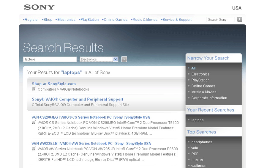
Figure 1: a screen capture from the Sony web site
How about Figure 2, taken from the Agilent web site. I’ve already had to select a pull down option from the home page just to get the search ‘medical’ to run; apparently that setting is ‘sticky’ on subsequent visits. The back image is the main web site; the front image is a search done from there for the term 'medical' that even includes some helpful facets.
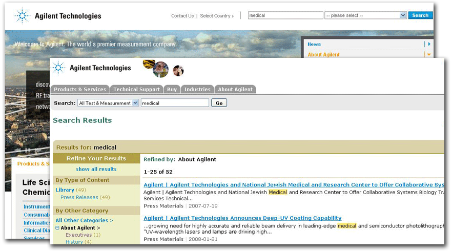
Figure 2: Agilent Technologies Home Page
Now I have energy - the searches have options for me to explore for my answers. I click on the ‘Technical Support’ tab, with the expectation that I’ll see search results for the term ‘medical’ in the Tech Support area of the site.
Instead, I have the opportunity to do another search (Figure 3). In fact, there are two search boxes: one just below the tab bar, with Technical Support already selected; and the other in the content area that says ‘Find by product…”.
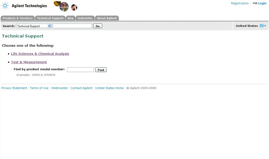
Figure 3: Technical Support Tab
Now which search box do I use? Well, if I search for ‘1600’, an old oscillator from HP, the result page I see varies depending on which of the two search buttons I use.
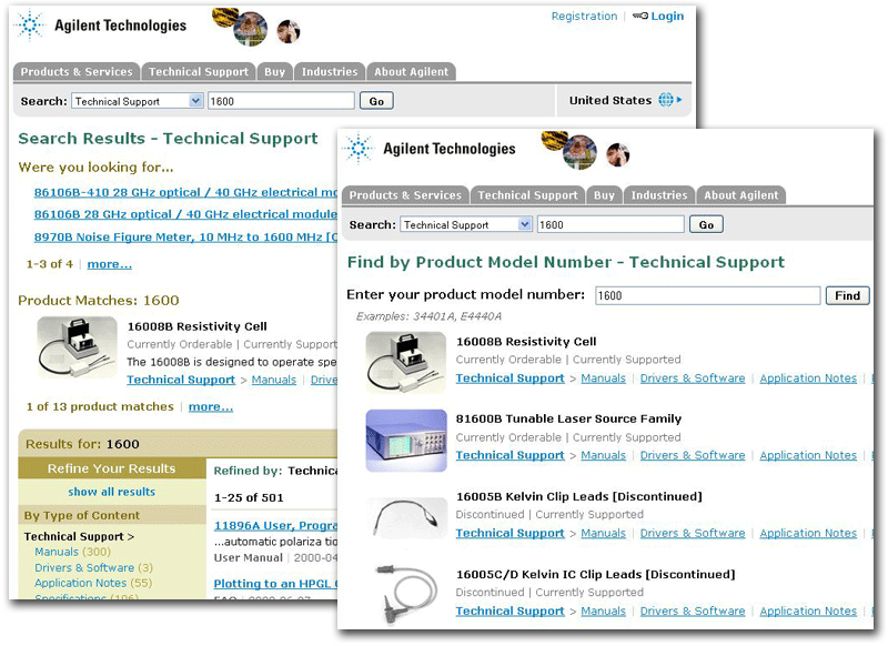
Figure 4: Different Results Depending on Search Box
When I search from the box at the top of the screen in Figure 3, I get results shown on the left side of Figure 4. It has a few suggested links, a best bet photo, and results not unlike the ones in Figure 2. But when I search from the box next to 'Search for Product' label in Figure 3, I get a similar but different result list, shown on the right of Figure 4. Two search boxes, two different - although similar - outcomes.
Summary
Sure, you can use all kinds of capabilities in your result list to provide additional content to your site searcher – faceted or parametric navigation, taxonomy browse tools, best bets. But do it with only a single search box. To paraphrase Steve Krug’s book title, don’t make your user have to think. Sure, structure results depending on content sources, formats, and other logical differentiators for your content – but only one search box!
Next month: more search best practices!